Physical Charts
The amazing folks at Microsoft Research Cambridge have come up with a few mechanical contraptions that elegantly represent data in the tangible and physical world. Here is the description of the project, from the web page:
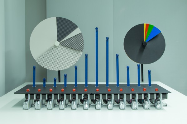
The physical charts are an attempt to make data and data visualisations legible to ordinary people in their daily lives. In response to the increasing sophistication of data visualisations and the seemingly unquestioning quest for novelty, the charts make playful use of long established and highly familiar representations like pie charts and bar graphs. Rather than estrange viewers, the objective is to enable them to, at a glance, engage with and comprehend data.
The physical and dynamic qualities of the charts are intended to draw people in to viewing data, differentiating them from screen-based visualisations that are beginning to lose their salience in our information-rich environments. The beauty of the charts is in how simple they are to read and how the physical mechanics produce strikingly visual (and tactile) representations of data.
Check the videos at http://research.microsoft.com/en-us/um/cambridge/projects/physicalcharts
The Physical Charts were designed and built by David Sweeney – with software development from Tim Regan and Alex Butler.
